OZ
Graphic Design Skills Practice
Description
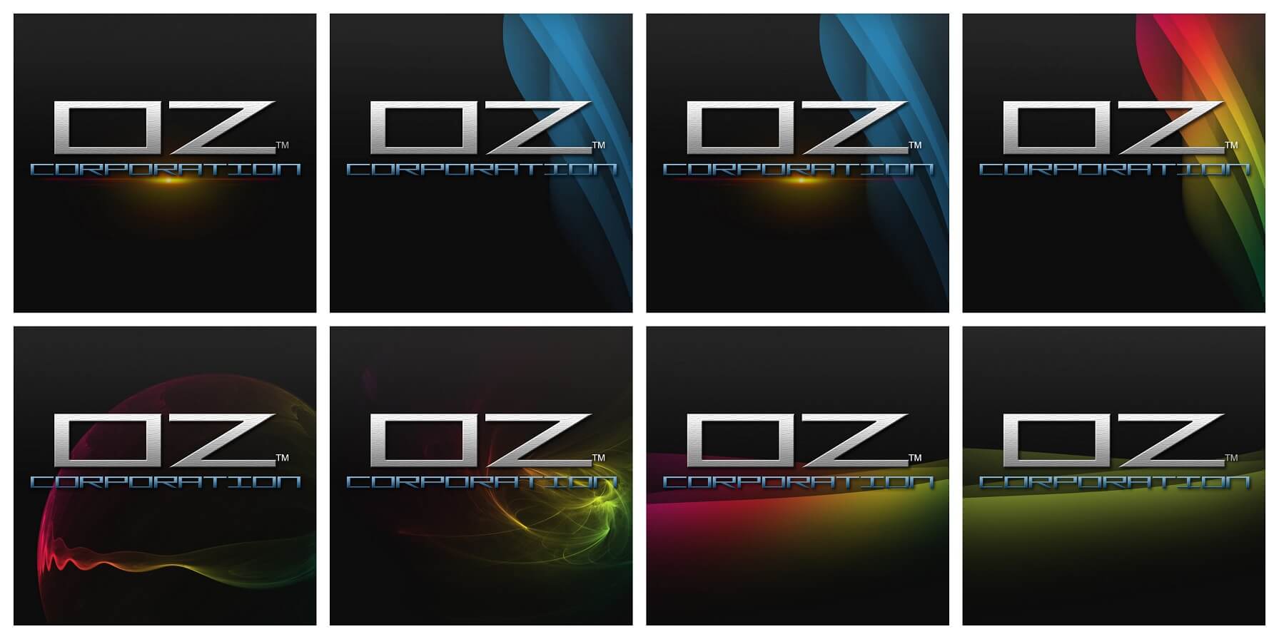
A personal design challenge I made in my freshman year in college. OZ Corporation is just a fictional name that I thought of, but later found out that it’s used everywhere. I have no intention of infringing any rights whatsoever. I made the main text look as if it were a solid steel. I mixed some gradients underneath the smooth abstract waves and they turned out looking great.
Technologies
- Adobe Photoshop
- Smooth Abstract Brush Pack
